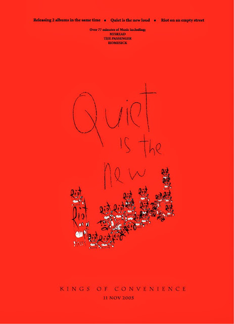
For my second advert analysis, I decided to pick the releasing advertisement of the duo folk band Kings of convenience's album <Quiet Is New Loud>/<Riot On a Empty Street>, interestingly they have released two albums at the same time with one advert, so it will be some unique designs in this material.
Graphically, the overall visual style and design is very creative and imaginative. The design of this advert is quite unconventional for a folk music advertisement, the whole advert doesn't contain any images of artists at all, instead it consists of text that be arranged in a rather interesting way and also a big shade of colour red as the background. The whole visual style has provided the audience a rather simple and unique feeling which follows the "brand identity"of folk musician and singer/song writer, also the visual design applies the "star image" of the Kings Of Convenience. Especially the combination of colour red and black is very impressive which could create the visual memory to the audience immediately. But the colour choice of this album advert is quite conventional, it has only contained three colours as the most of folk music album adverts, also this simple colour choice reflects to the folk genre conventions which is simple.
Conventionally, this advertisement has contains all the necessary informations of the album releasing event which includes the name of artists, the releasing date, and most importantly the album names, because they are releasing two albums at the same time therefore this album has contained the name of two albums, also the hit singles from these two albums.
The most tention-absorbing element of this advertisement is definitely the two album names in the centre of the image, due to the reason that in this releasing event the band were planning to release two albums at the same time, therefore the two albums' name has been designed and arranged in a very unique and thoughtful in the centre of the advert. The first name that appears in the advert is the <Quiet is the new loud> that appears in a hand-writing alike font, which created the simple and elegant feeling to the advert, but at the last word of that album name, the word "Loud" is being consists of words from another album name <Riot on an empty street>, this design is very creative and impressive, it could definitely create the visual memory to the viewers straightforwardly and also creates the nostalgia atmosphere to the audience overall.
The font choice of this album advert is very thoughtful as well, the font choice for the album names and hit singles on the top of the advert and also the releasing date and the artist name on the bottom is quite simple, basically it provides the viewers a typewriter alike visuals, and follows the genre conventions of folk music which is create the nostalgia atmosphere to the audience. And also the album names in the centre has used a hand-writing alike font which seems a bit messy but still created a good visual contact to the audience and also created the nostalgia atmosphere to the audience which applies the genre characteristics to the audience.
Overall, the design and content of this album advert is excellent, it not only provides the necessary informations to the viewers about the album releasing event, but also arranged all the informations and visuals within the advert in a very creative and imaginative way. Although this album seems very unconventional and unique, but it applies all the necessary genre conventions within it, that is some character I'm willing to contribute in my own advert design as the project evolving.
